[ React 블로그 개발 ] 4. 사이드바(Left, Top, Middle, Right) 분리
2025-08-18
다양한 위치의 사이드바 구현 방법과 구조화
1. 여러 위치에 사이드바가 필요한 이유
- 다양한 레이아웃
- 사용자 경험
- 정보 구분
2. 각 사이드바의 역할과 구조
- Left: 내비게이션
- Top: 사용자 정보/알림
- Middle: 퀵메뉴/컨텐츠
- Right: 유틸리티/광고/프로필 등
3. 컴포넌트 분리 코드 예시
-
src/components/SidebarLeft.tsx
- 좌측 Sidebar를 component로 나눕니다.
-
export default function SidebarLeft() {
  return (
    <div className="sidebar-left" style={{ width: "20%" }}>
      <h1>Sidebar Left</h1>
      <p>This is the left section of the sidebar.</p>
    </div>
  );
}
-
src/components/SidebarRight.tsx
- 우측 Sidebar를 component로 나눕니다.
-
export default function SidebarRight() {
  return (
    <div className="sidebar-right" style={{ width: "20%" }}>
      <h1>Sidebar Right</h1>
      <p>This is the right section of the sidebar.</p>
    </div>
  );
}
-
src/components/TopComponent.tsx
- 상단에 들어갈 Component를 나눕니다.
- 해당 컴포넌트 없이 바로 메인글이 나오도록 해도 됩니다.
-
export default function TopComponent() {
  return (
    <div className="sidebar-top">
      <h1>Sidebar Top</h1>
      <p>This is the top section of the sidebar.</p>
    </div>
  );
}
- 상단에 들어갈 Component를 나눕니다.
-
src/components/MainComponent.tsx
- MainComponent를 따로 나눈 이유는 좌측,우측을 제외하고 중앙에서 상단,메인,하단 등을 추가로 나누기 위해 나누었습니다.
-
import { MainScreen } from "../screens";
import TopComponent from "./TopComponent";

export default function MainComponent() {
  return (
    <div className="main-component" style={{ width: "100%" }}>
      <TopComponent />
      <MainScreen />
    </div>
  );
}
-
src/components/AppTopComponent.tsx
- Mobile 화면에서 상단에 들어갈 Component를 나눕니다.
-
export default function AppTopComponent() {
  return (
    <div className="app-top-component">
      <h1>App Top Component</h1>
      <p>This is the top section of the application.</p>
    </div>
  );
}
-
src/components/index.ts
- 컴포넌트들을 한 곳에서 모아 export하는 방식 [배럴 파일(barrel file) 패턴]
-
export { default as AppTopComponent } from "./AppTopComponent";
export { default as MainComponent } from "./MainComponent";
export { default as SidebarLeft } from "./SidebarLeft";
export { default as SidebarRight } from "./SidebarRight";
export { default as TopComponent } from "./TopComponent";
-
src/screens/MainScreen.tsx
- 메인 내용이 들어갈 화면 입니다.
-
export default function MainScreen() {
  return (
    <div className="main-screen">
      <h1>Main Screen</h1>
      <p>This is the main content area of the application.</p>
    </div>
  );
}
-
src/screens/index.ts
- 컴포넌트들을 한 곳에서 모아 export하는 방식 [배럴 파일(barrel file) 패턴]
-
export { default as MainScreen } from "./MainScreen";
-
src/main.tsx
-
레이아웃 구조와 css를 변경하는 것으로 화면의 배치를 다르게 변경할 수 있습니다.
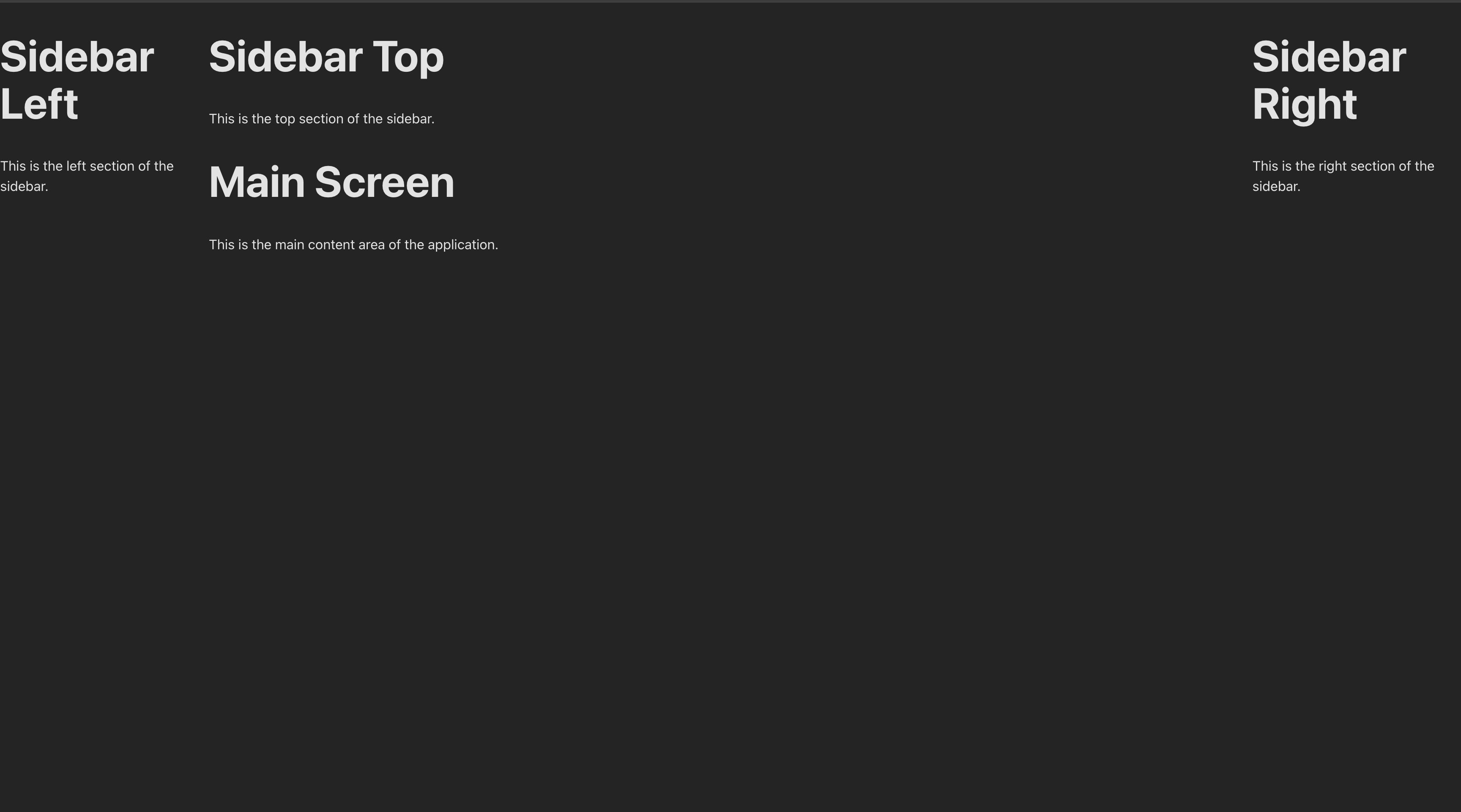
- (ex. 1번) 좌측,우측이 최상단부터 시작하는 구조
-
import { StrictMode } from "react";
import { createRoot } from "react-dom/client";

import {
  AppTopComponent,
  MainComponent,
  SidebarLeft,
  SidebarRight,
  TopComponent,
} from "./components/index.ts";
import "./index.css";
import { Mobile, PC } from "./utils/MobileCheck.tsx";

export const AppEntry = () => {
  return (
    <div
      style={{
        display: "flex",
        width: "100%",
        height: "100vh",
        flexDirection: "row",
      }}
    >
      <PC>
        <SidebarLeft />
      </PC>
      <div style={{ width: "100%" }}>
        <PC>
          <TopComponent />
        </PC>
        <Mobile>
          <AppTopComponent />
        </Mobile>
        <MainComponent />
      </div>
      <PC>
        <SidebarRight />
      </PC>
    </div>
  );
};

...
-
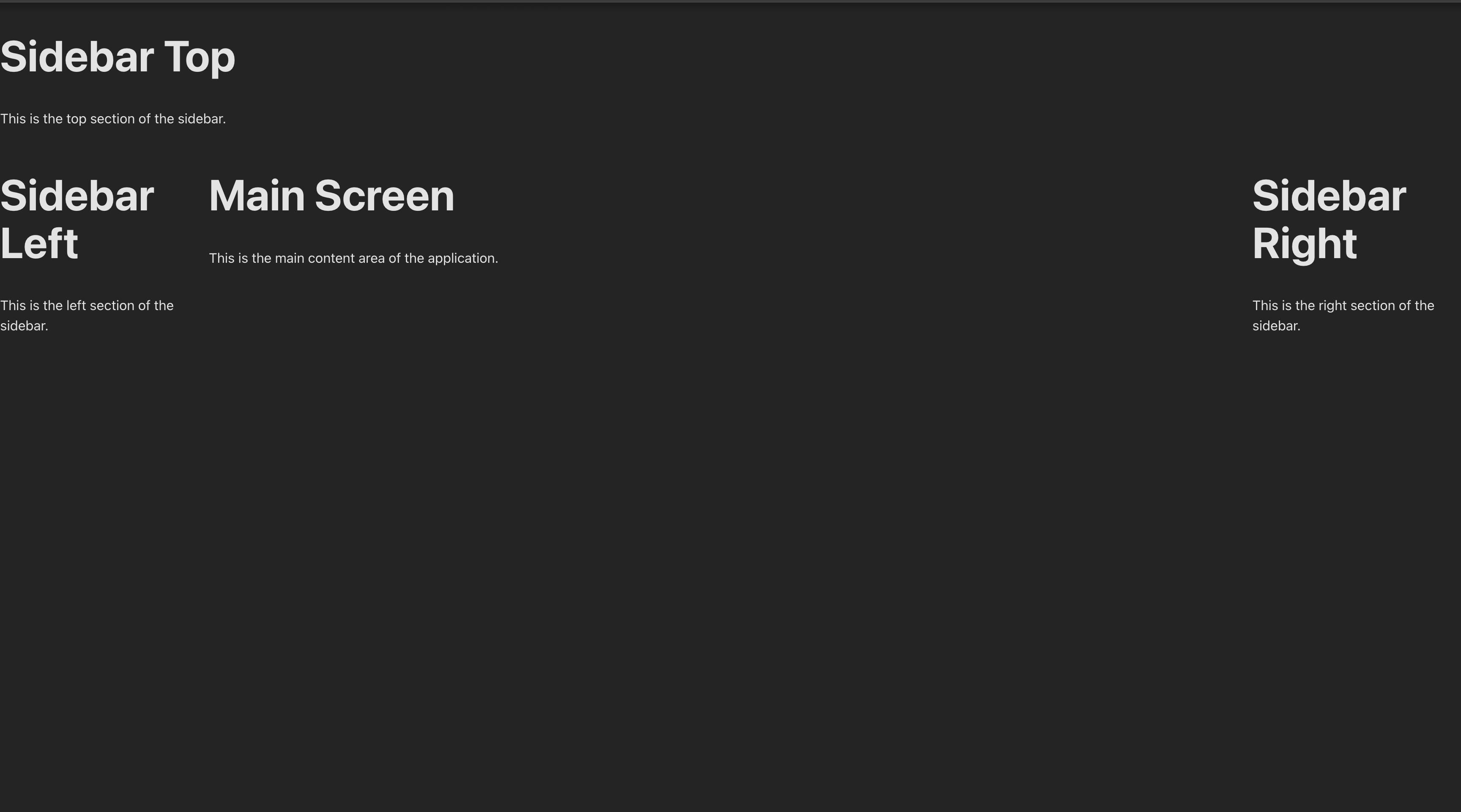
- (ex. 2번) 상단 component의 좌,우를 최대로 키우고 바로 밑으로 좌측,메인,우측으로 나누는 구조
-
import { StrictMode } from "react";
import { createRoot } from "react-dom/client";

import {
  AppTopComponent,
  MainComponent,
  SidebarLeft,
  SidebarRight,
  TopComponent,
} from "./components/index.ts";
import "./index.css";
import { Mobile, PC } from "./utils/MobileCheck.tsx";

export const AppEntry = () => {
   return (
    <div
      style={{
        width: "100%",
      }}
    >
      <PC>
        <TopComponent />
      </PC>
      <Mobile>
        <AppTopComponent />
      </Mobile>

      <div style={{ width: "100%", display: "flex", flexDirection: "row" }}>
        <PC>
          <SidebarLeft />
        </PC>
        <MainComponent />
        <PC>
          <SidebarRight />
        </PC>
      </div>
    </div>
  );
};

...
-
- (ex. 1번) 좌측,우측이 최상단부터 시작하는 구조
-
-
src/index.css
- 컴포넌트가 현재 display 화면에 맞는 최대 크기를 유지하기 위해서 css를 변경했습니다.
-
body {
	...,
	flex-direction: column;
}

#root {
	width: 100%;
}
-
- 컴포넌트가 현재 display 화면에 맞는 최대 크기를 유지하기 위해서 css를 변경했습니다.
-
예시 이미지
- ex. 1
- ex. 2
- ex. mobile ( width: 768 이하일 경우 )
- ex. 1

4. 마무리 및 다음 단계
-
이번 글에서는 Sidebar를 나누는 방법에 대해 적어보았습니다.
-
다음 단계는 좌측에 메뉴를 불러오는 포스트를 쓸지, 화면 레이아웃을 우선 적용해볼지 고민입니다..
참고: git sample react blog code